Information
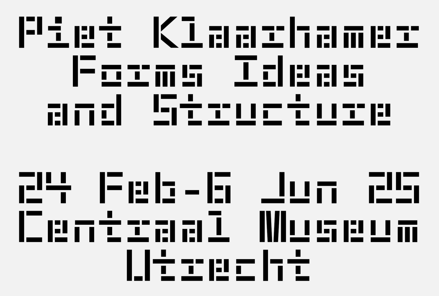
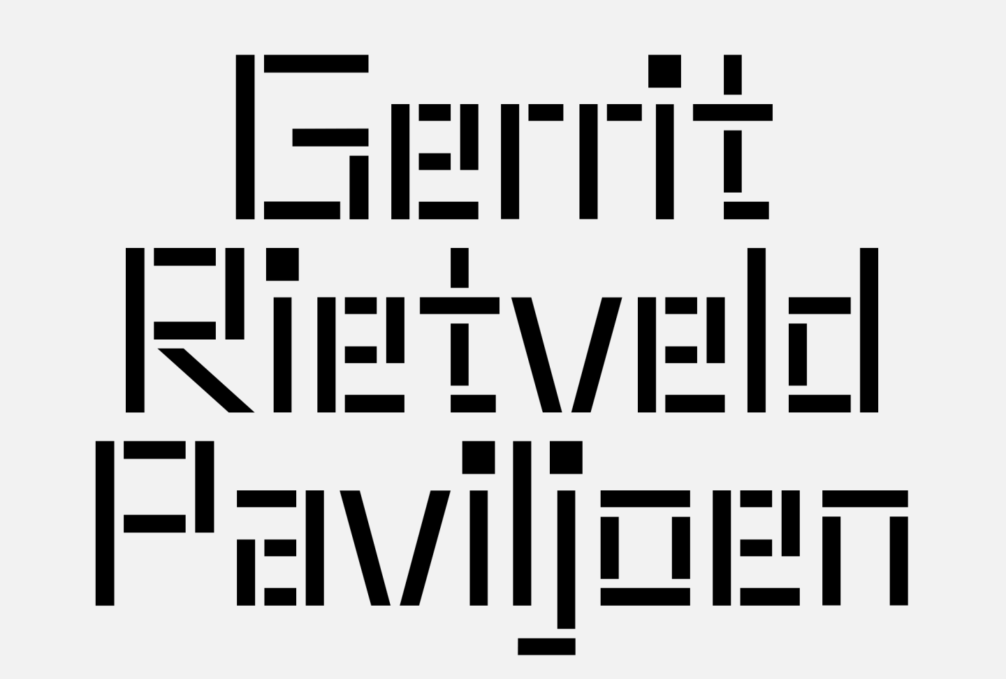
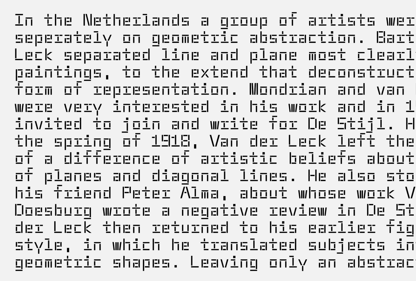
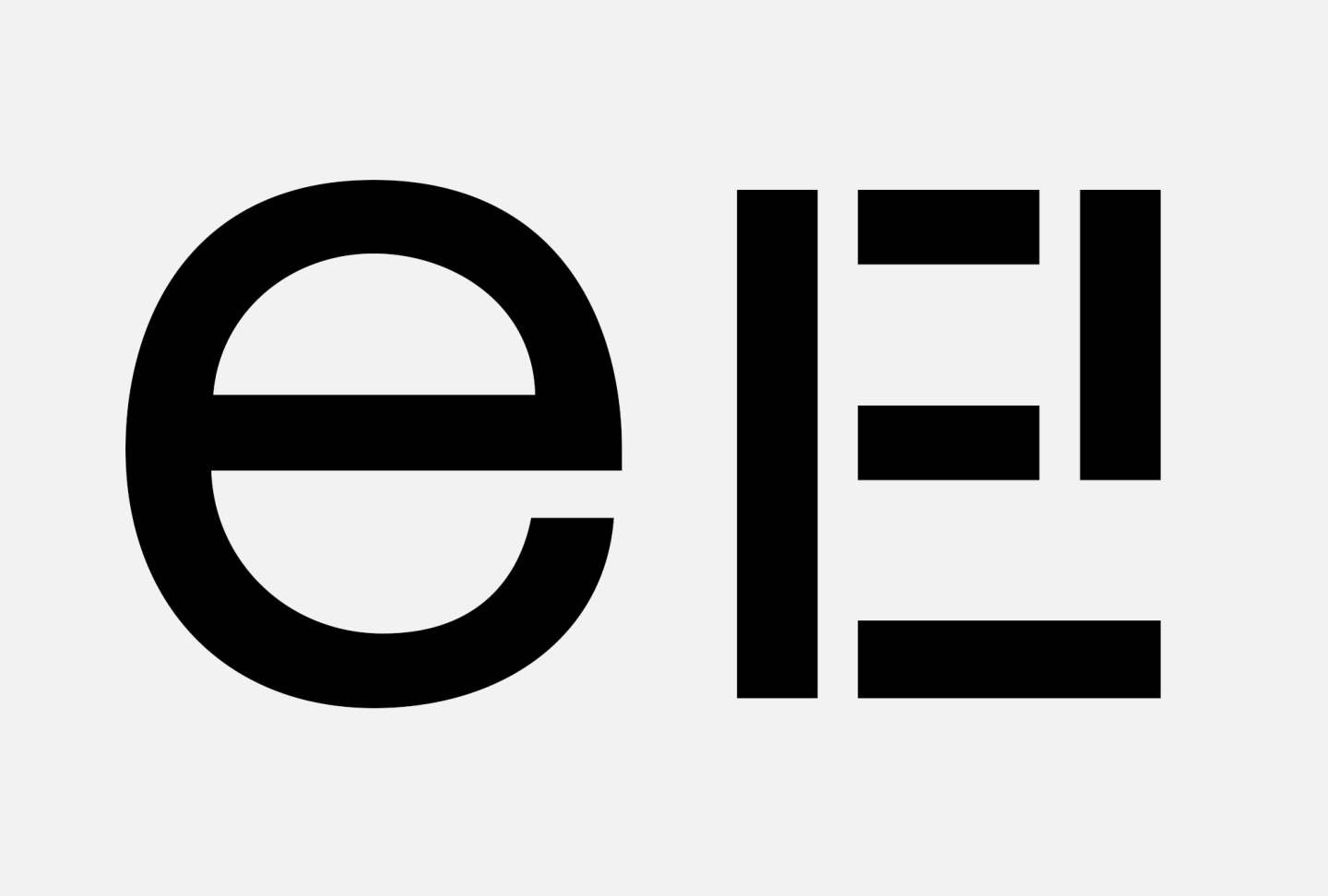
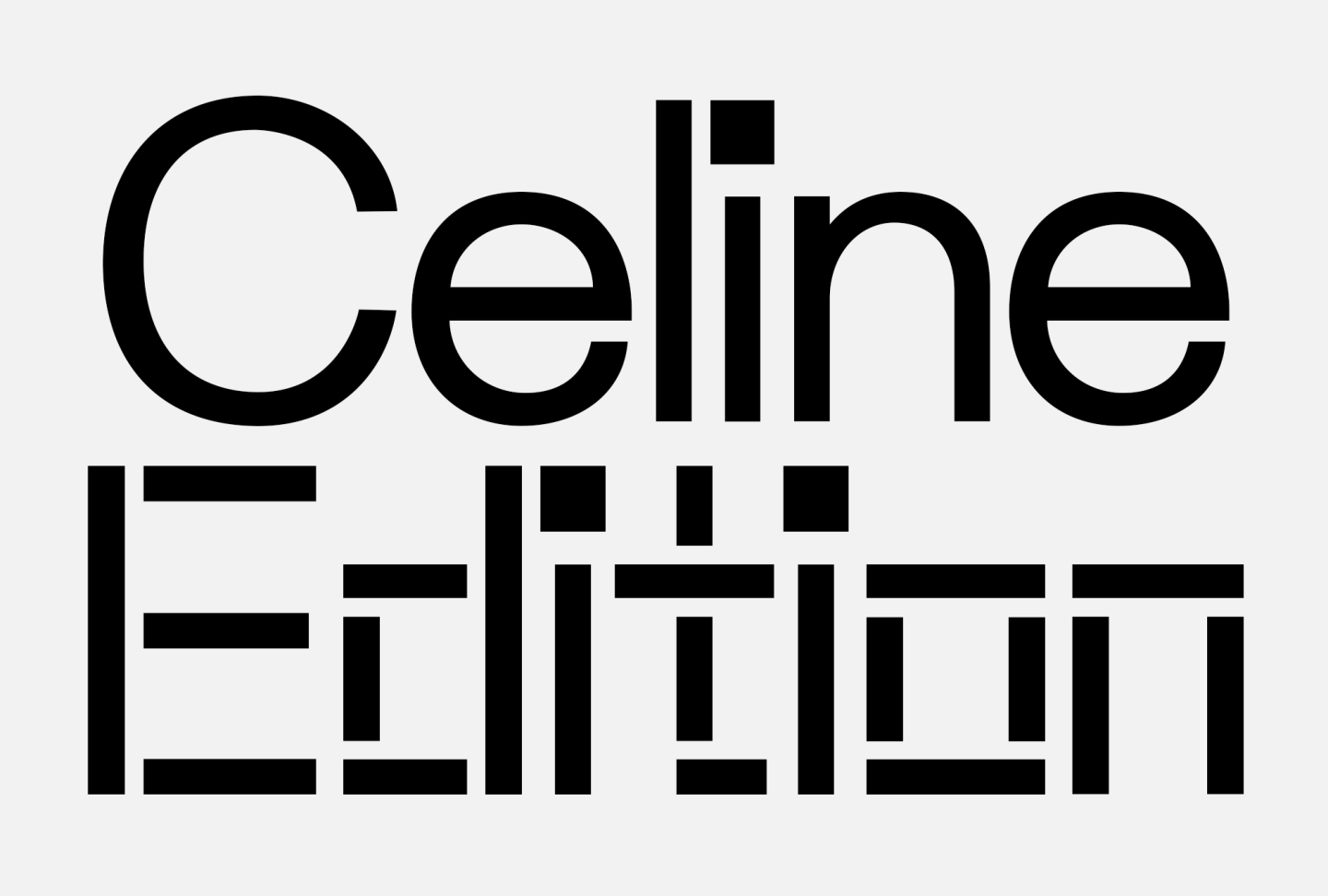
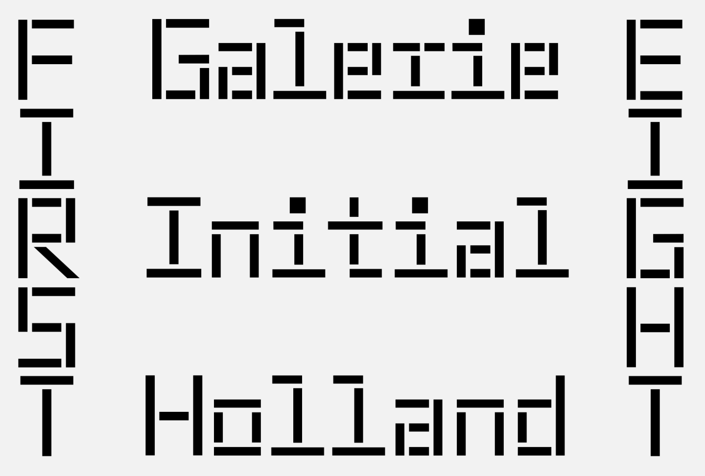
Rietveld is a geometric typeface based on the design of Maxeville, following its proportions. Expanding the idea of constructed typography. The Rietveld family is designed in the Dutch tradition of reduction and soberness and influenced by the work of Gerrit Rietveld, more so of his colleague and fellow De Stijl member Bart van der Leck. Specifically his studies of deconstructing images to abstract compositions and his typographic expressions from the 1930s’. Resulting in letterforms composed exclusively from vertical, horizontal and diagonal shapes - creating an abstract but legible rhythm.
Geometric
V.1.0 Release December 2024
Design and Development by Mark Niemeijer
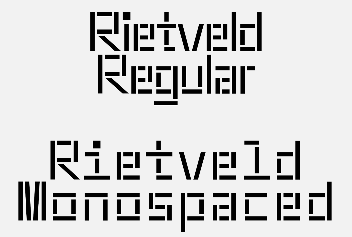
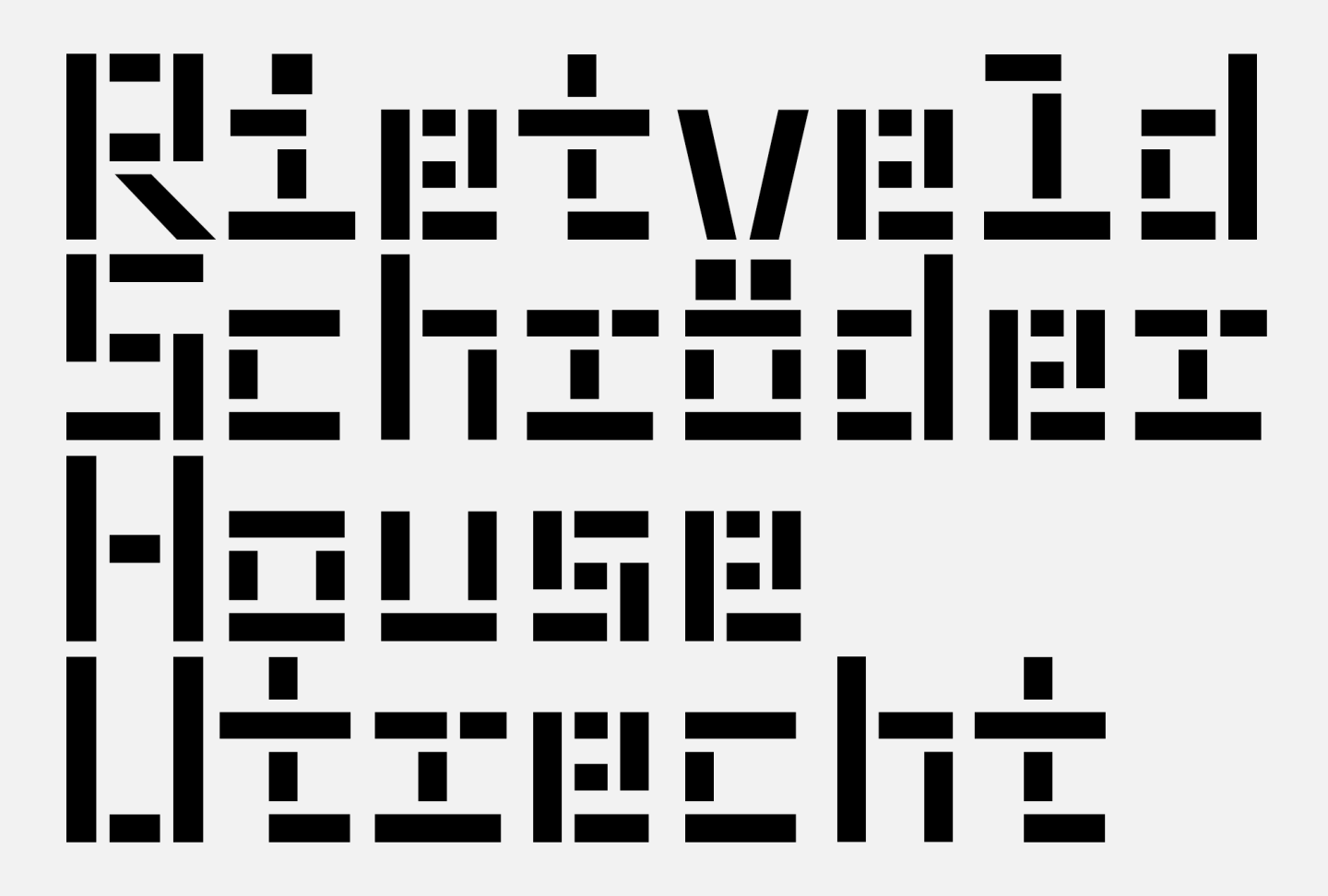
Rietveld Typeface Character Overview
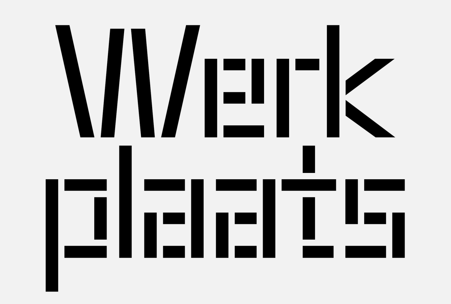
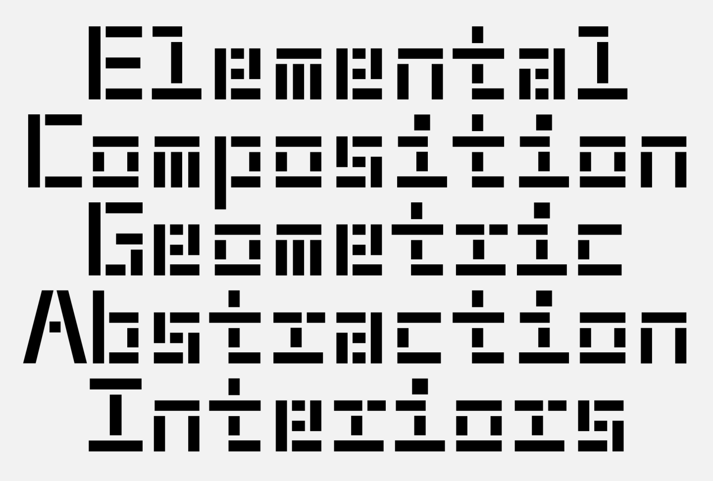
Rietveld Family
If you are considering specific variations that contribute to making your project stand out, feel free get in touch for possibilities and more information. At SM Foundry we offer typeface customization, language extentions and other typographic design services.